

12 Most Terrifying Heavy-Metal Album Covers – The Real Stories Behind the Gore (Ranked & Explained)
Heavy metal and horror go together like a Gibson SG and a Marshall stack. You can’t have one without the other. But sometimes, a band decides to push the envelope so far off the table that it lands in a police evidence locker. We’re talking about album art that doesn’t just look cool on a t-shirt; it haunts you. It makes you check the locks twice.
Whether it’s a grainy photo of a real tragedy or a painting so grotesque it got banned in three continents, the best metal covers tell a story before you even drop the needle. But which ones are the scariest? I’ve dug into the history books, verified the grisly details, and ranked the 10 most disturbing, nightmare-inducing slabs of album art in metal history.
Grab a beverage, keep the lights on, and let’s dive in.
12. Autopsy – Severed Survival (1989)
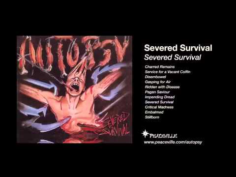
The Artist: Chris Reifert – vocals, drums. Danny Coralles – guitar. Eric Cutler – guitar.
The Scare Factor: Visceral body horror (Try not to flinch).
Before Kev Walker became a legend illustrating cards for Magic: The Gathering, he created one of the most stomach-churning images in death metal history. The original cover for Autopsy’s debut doesn’t feature monsters or ghosts. Instead, it shows a conscious human being held up by jagged meat hooks tearing through their skin, while zombie surgeons prepare to operate.
It’s not just the g@re; it’s the physics of it.
Why it hits hard:
Unlike fantasy violence, this taps into a very specific physical phobia. Looking at the tension on the skin where the hooks pull? It triggers a “mirror neuron” response where you can almost feel the pain yourself.
Insight: This cover was deemed too grotesque for distribution and was famously banned. The label forced the band to commission a second, “tamer” cover (which still featured zombie doctors, but less hook-torture). However, the original “Hooks” cover remains the definitive version for fans who can handle the cringe-inducing reality of human fragility.
11. Acid Bath – When the Kite String Pops (1994)
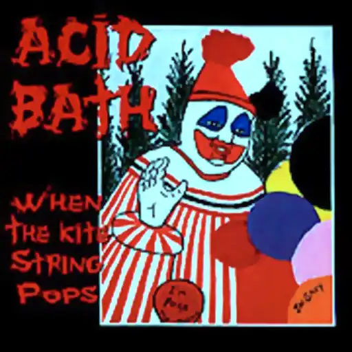
The Artist: John Wayne Gacy (Yes, that John Wayne Gacy)
The Scare Factor: The banality of true evil.
At first glance, the cover looks like a strange, poorly painted picture of a clown with skull balloons. It seems almost childish or kitschy. But the terror sets in when you read the liner notes. This self-portrait was painted in prison by John Wayne Gacy, the serial killer who r@ped and m@rdered at least 33 young boys and buried them in his crawl space. He famously performed at children’s parties as “Pogo the Clown.”
Why it hits hard:
Separating art from the artist is impossible here. The cover forces you to look directly into the mind of a psychopath. It’s not a “scary picture” created by a heavy metal illustrator trying to look edgy; it is a genuine artifact from the brain of a monster.
Insight: The band didn’t use this for shock value alone; they wanted to reflect the innocent-sounding title When the Kite String Pops against the horrific reality of lost childhood innocence. It serves as a chilling reminder that the scariest monsters in the world look like regular people or worse, friendly clowns.
10. Iron Maiden – Fear of the Dark (1992)
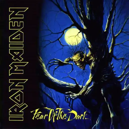
The Artist: Melvyn Grant
The Scare Factor: Primal childhood terror.
We’re kicking this off with a classic. You might be thinking, “Maiden? Really? Eddie is basically a cartoon character!” And usually, you’d be right. But Fear of the Dark is different.
For the first time in the band’s history, they ditched their longtime artist Derek Riggs and brought in Melvyn Grant. The result was a shift from the comic-book style of the 80s to something far more sinister. This isn’t Eddie flying a fighter jet or fighting the devil; this is Eddie as the Nosferatu of nature, a tree-monster fusing with the moonlight to stalk you.
Why it hits hard: It taps into that universal, fear of walking home alone at night. You know that feeling when a tree branch looks like a claw? Grant captured that exact moment of paranoia. It’s the visual equivalent of a jump scare.
9. Anaal Nathrakh – The Codex Necro (2001)
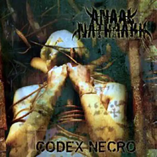
The Artist: Mick Kenney
The Scare Factor: Real-life suffocation.
British extreme metal duo Anaal Nathrakh doesn’t do “subtle.” Their music sounds like the apocalypse, and their debut album cover looks like a snuff film still. The grainy, high-contrast image shows a person with a bag over their head, screaming in agony while being strangled.
Here’s the kicker: it’s not a movie prop. The man in the photo is actually the younger brother of band member Mick Kenney. They staged the photo to look as authentic as possible, and… well, mission accomplished.
Insight: The raw, blown-out “xeroxed” look of the image wasn’t just an aesthetic choice; it mirrors the industrial, mechanical chaos of the music. It forces you to wonder: Is this real? That ambiguity is what makes it stick in your brain.
8. Cattle Decapitation – Humanure (2004)
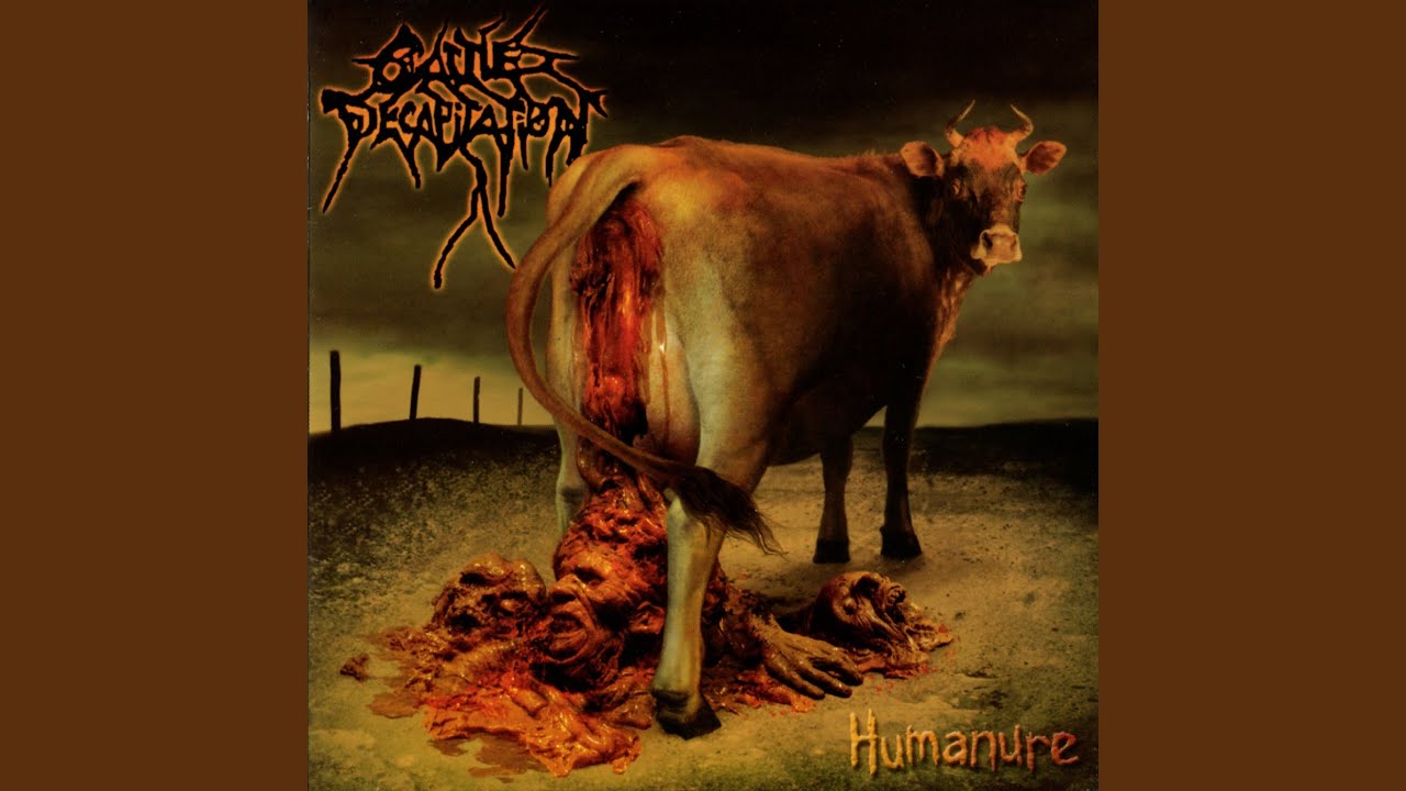
The Artist: Wes Benscoter
The Scare Factor: Grotesque role reversal.
If you have a weak stomach, skip this one. Deathgrind legends Cattle Decapitation are known for their pro-animal rights, anti-human lyrics, and Humanure is their visual manifesto. The cover art, painted by horror master Wes Benscoter, depicts a cow standing on a barren earth, excreting a pile of human remains.
It’s disgusting, yes, but it’s also a brilliant, horrifying parody of Pink Floyd’s Atom Heart Mother. Where Floyd’s cow stood in a lush green pasture, Cattle Decap’s cow stands in a wasteland of our own making.
The Aftermath: Retailers hated it. The label had to issue a version with the cow removed, leaving just the empty wasteland. But once you’ve seen the original, you can’t unsee it. It’s “scary” because it’s a reflection of humanity effectively flushed down the toilet.
7. Pungent Stench – Been Caught Buttering (1991)
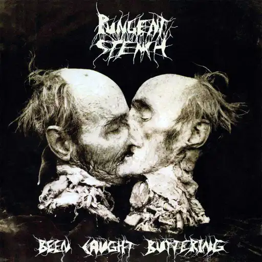
The Artist: Joel-Peter Witkin (Photographer)
The Scare Factor: High-art morbid curiosity.
At first glance, this cover looks like two decayed heads sharing a kiss. It’s romantic in a twisted, Tales from the Crypt sort of way. But the reality is far worse.
The image is a famous photograph titled Le Baiser (The Kiss) by controversial artist Joel-Peter Witkin. It does not depict two people. It depicts one severed head, sawed perfectly in half down the middle, with the two halves arranged to face each other.
Why it ranks: It bridges the gap between “shock value” and “art.” Knowing that this was a real human cadaver, manipulated for art, creates a deep, sinking feeling in your gut. It challenges your definition of beauty and horror simultaneously.
6. Slayer – Reign in Blood (1986)
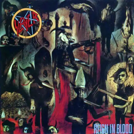
The Artist: Larry Carroll
The Scare Factor: Subliminal hellscape.
Slayer’s magnum opus is fast, aggressive, and evil. The cover art matches that energy perfectly. Created by mixed-media artist Larry Carroll, it’s a collage of painting and photography that looks like a fractured nightmare. You have a goat-man on a throne (Satan? A bishop?), severed heads, and bodies hanging in purgatory.
Insight: Carroll wasn’t a “metal” artist; he was an illustrator for The Progressive and The New York Times. Slayer hired him specifically to get something “different.” And if you look closely, really closely, at the figure with the bishop’s hat, you might notice some explicit phallic details that flew under the censors’ radar for decades. It’s a chaotic, psychological assault that feels like madness on canvas.
5. Brujeria – Matando Güeros (1993)
The Artist: Unknown Photographer (from ¡Alarma! magazine)
The Scare Factor: Real-world violence.
No painting can compete with reality. Brujeria, a deathgrind supergroup posing as Mexican drug lords, used a photo from the sensationalist Mexican crime magazine ¡Alarma! for their debut. The cover features a hand holding up a severed, charred head.
The head was nicknamed “Coco Loco” by the band and became their mascot. But let’s not forget: that was a real person. This album came out when the world was just waking up to the brutality of cartel violence. It removed the fantasy element of heavy metal g@re and replaced it with a cold, hard news flash.
The Impact: It was banned in multiple countries, but the image became legendary. It’s scary because it’s not trying to be “spooky” it’s just documenting a grim reality.
4. Korn – Korn (1994)
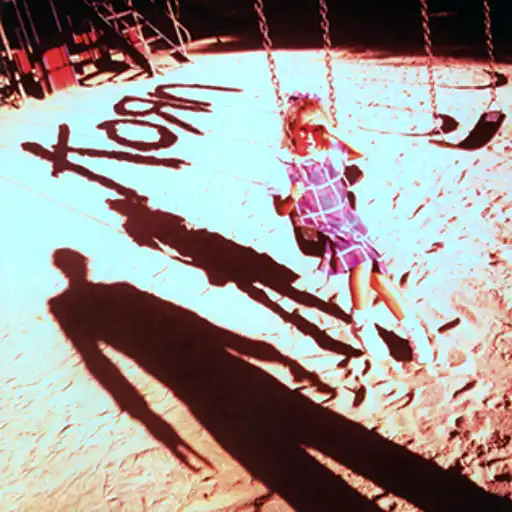
The Photographer: Stephen Stickler
The Scare Factor: The predator in plain sight.
You don’t need blood and guts to be terrifying. Sometimes, a shadow is enough.
Korn’s self-titled debut cover is a masterclass in suggested horror. It shows a young girl (Justine Ferrara, the niece of a record label rep) on a swing, squinting into the sun. She’s looking at a man standing over her, but we only see his shadow. The shadow’s hands are elongated, almost like claws or tools.
Behind the Scenes: The “shadow man” was actually co-art director Dante Ariola, who was making creepy shapes with his hands to block the sun from Justine’s eyes. The band’s logo, scrawled in crayon, adds to the innocent vibe. But then you turn the album over… and the swing is empty.
Why it’s top 5: It hits a nerve that monsters aren’t dragons or demons; they are people. It implies abduction and abuse without showing a single drop of blood. It is undeniably the most unsettling image of the 90s.
3. Cannibal Corpse – Butchered at Birth (1991)
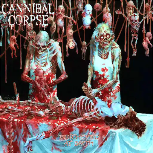
The Artist: Vincent Locke
The Scare Factor: The gold standard of g@re.
You knew they’d be here. Cannibal Corpse basically invented the “offensive album cover” game. Butchered at Birth is widely considered their most shocking visual. It depicts two zombie butchers dissecting a woman while undead babies hang from the ceiling like cured meats.
The Controversy: This album was banned in Germany (and other places) for decades. You literally could not buy it. Artist Vincent Locke, who also did the Dead World comics, created a watercolor nightmare that looks wet, visceral, and vile.
It ranks this high because it’s the cover that defined death metal. It was the litmus test for parents: if you owned this CD, you were officially a problem child. It’s pure, unfiltered shock art.
2. Mayhem – Dawn of the Black Hearts (1995)
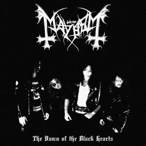
The Photographer: Euronymous
The Scare Factor: A s@icide note in jpeg format.
This is the one that separates the tourists from the locals.
In 1991, Mayhem’s vocalist, Per “Dead” Ohlin, committed s@icide in the band’s shared house. When guitarist Euronymous found the body, he didn’t call the police immediately. instead, he went to a nearby shop, bought a disposable camera, rearranged some items at the scene, and took photos of his dead friend.
One of those photos became the cover of this bootleg live album.
The Reality: You are looking at a corpse. A fresh, real corpse of a 22-year-old musician. There is no art direction, no metaphor. It is the single most exploitative, cold-blooded image in music history. It’s scary not just because of the g@re, but because of what it says about the person holding the camera.
1. Black Sabbath – Black Sabbath (1970)
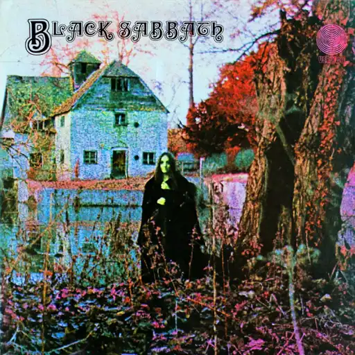
The Photographer: Keith Macmillan (credited as “Keef”)
The Model: Louisa Livingstone
The Scare Factor: The birth of Heavy Metal.
Why is this number one? Because without this image, none of the others would exist.
Released on Friday the 13th, 1970, this cover captures the exact moment rock and roll turned evil. Shot at the Mapledurham Watermill in Oxfordshire, England, it features a mysterious, pale woman in black robes standing in front of a desolate, autumnal landscape.
Insight: For 50 years, people thought the woman was a witch, or maybe Ozzy in drag. But in 2020, she was identified as Louisa Livingstone, a model and actress. She recalls the shoot being freezing cold, Macmillan was using a smoke machine and dry ice to get that eerie haze.
Why it wins: It’s atmospheric perfection. It looks like a spirit photograph from the 1800s. It doesn’t scream at you; it whispers. The graininess, the dead leaves, the dead stare, it created a mood that defined an entire genre. It proves that you don’t need severed heads or zombies to scare someone. You just need a woman in black, standing alone, watching you.
Are You Brave Enough to Listen?
These albums aren’t just collections of songs; they are artifacts of horror. They challenged censorship laws, broke moral codes, and gave us nightmares we secretly loved.
Frequently Asked Questions About Scary Metal Album Covers
What is considered the scariest heavy metal album cover of all time?
Many fans and critics consider Dawn of the Black Hearts by Mayhem to be the scariest metal album cover ever. The image uses a real photograph taken after the suicide of vocalist Dead, making it uniquely disturbing due to its real-life context rather than illustrated horror.
Are any metal album covers based on real death or violence?
Yes. Several metal album covers feature real death or imagery tied to real events. The most infamous example is Dawn of the Black Hearts, which shows an actual corpse. Other albums, such as Butchered at Birth, use extreme illustrated gore inspired by real-world violence and horror imagery.
Which metal album covers were banned or censored?
Many albums on this list faced bans or censorship in certain countries or retailers. Butchered at Birth was banned in multiple regions due to its graphic artwork, while Matando Güeros was frequently pulled from shelves because of its violent imagery and political controversy.
Why do death metal and grindcore albums have such extreme cover art?
Extreme metal genres like death metal and grindcore often use shocking album art to reflect themes of mortality, violence, and social decay. Albums such as Humanure and Severed Survival use graphic visuals to match the brutality and confrontational nature of their music.
Is the cover of Fear of the Dark actually scary?
While not graphic, Fear of the Dark is considered scary due to its atmosphere and symbolism. Eddie’s monstrous transformation in a dark, urban setting plays on psychological fear rather than gore, making it disturbing in a subtler way than many extreme metal covers.
Why is Black Sabbath (1970) considered frightening without gore?
The cover of Black Sabbath is frightening because of its eerie realism and ambiguity. The shadowy figure, washed-out colors, and unsettling mood created a sense of dread that helped define the visual language of heavy metal long before graphic imagery became common.
Did Korn’s debut album use a real photograph?
Yes. The cover of Korn uses a manipulated photograph featuring a child on a playground, implying danger and abuse. Its power comes from suggestion rather than explicit violence, which many listeners find more disturbing than gore-heavy artwork.
What makes When the Kite String Pops so disturbing?
When the Kite String Pops features artwork based on a painting by serial killer John Wayne Gacy. The association with a real-life murderer adds an extra layer of horror that goes beyond typical metal shock imagery.
Are illustrated album covers scarier than photographic ones?
It depends on context. Illustrated covers like Butchered at Birth rely on exaggerated gore, while photographic covers such as Dawn of the Black Hearts can feel more disturbing because they depict real events. Many fans consider realism to be more unsettling than illustration.
Why do some people consider Reign in Blood scary despite its stylized art?
Reign in Blood is frightening due to its chaotic, hellish imagery and the album’s reputation. The combination of violent artwork, aggressive music, and lyrical themes amplifies its impact beyond the visual alone.
Are these album covers meant to offend or to tell a story?
In most cases, the artwork is meant to reflect the themes and tone of the music rather than offend for shock value alone. Albums like The Codex Necro use disturbing visuals to reinforce themes of hatred, nihilism, and extremity central to their sound.
What should listeners know before viewing these album covers?
Some covers on this list contain graphic or disturbing imagery. Viewers should be aware that albums such as Humanure and Butchered at Birth include explicit visuals that may not be suitable for all audiences.

