

From Page to Screen Disaster: Comic-Accurate Suits That Flopped on Film
In the world of comic book movies, fans constantly clamor for one thing: authenticity. They want to see their favorite heroes leap from the page to the screen, looking exactly as they remember. But as any true believer knows, sometimes getting what you wish for can be a total disaster.
There’s a fine line between a faithful adaptation and a cringeworthy catastrophe. Some costumes are so perfectly translated that they become iconic. Others? Well, they prove that what works in a comic panel doesn’t always work in the real world.
look at the comic-accurate suits that were a massive swing and a miss on the big screen.
1. The Phantom (1996) – A Purple Problem
starting with a classic case of “be careful what you wish for.” The 1996 film The Phantom gave us a hero clad in a skin-tight, full-body purple jumpsuit. Was it accurate to the 1930s comic strip? Absolutely. Did it look good? Oh, hell no.
Why it Flopped:
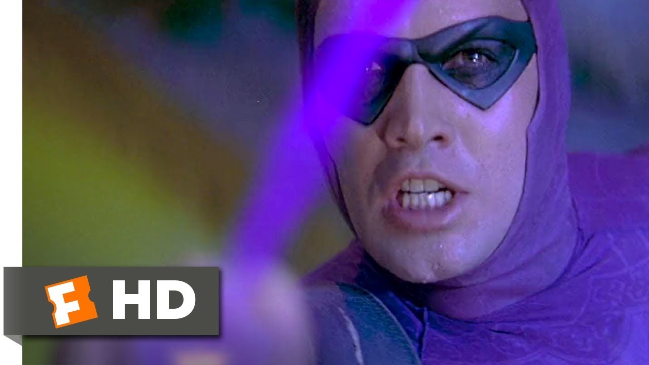
- The Goofball Factor: In the vibrant, four-color world of comics, a purple-suited jungle hero can look mysterious and cool. On a real-life actor (the very capable Billy Zane), it just looked silly. It lacked any sense of intimidation and, frankly, looked more like a rejected Power Ranger than the “Ghost Who Walks.”
- A Product of Its Time: The Phantom’s costume is a relic of a bygone era. Modern superhero suits, even the colorful ones, often incorporate textures, armor plating, and practical elements to make them believable. This was just… purple spandex.
- The Color Purple: There’s a reason you don’t see many purple-clad heroes swinging into action. It’s an incredibly difficult color to take seriously in a live-action context.
One fan on Reddit summed it up perfectly: “The Phantom movie is a perfect example of why some things should stay on the page. I wanted a comic-accurate suit, and I got it. And I immediately regretted it.”
2. Green Lantern (2011) – The Uncanny Valley of CGI
This one still hurts. The Green Lantern’s suit is one of the most iconic in DC Comics. And to be fair, the 2011 film starring Ryan Reynolds tried to do something unique and comic-accurate by making the suit a construct of the ring’s energy. The problem? The technology just wasn’t there.
Why it Flopped:
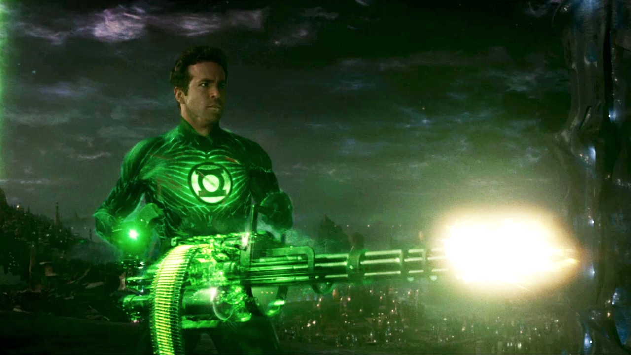
- Weightless and Fake: Instead of a tangible suit, Reynolds was covered in a motion-capture suit that was later replaced with a fully CGI creation. The result was a costume that looked weightless, textureless, and completely detached from the actor. It was a constant, glowing reminder that you were watching a special effect, not a superhero.
- Over-Designed and Unnecessary: The CGI suit had weird, pulsating muscle striations and an odd, organic look that was distracting. It was a classic case of “just because you can, doesn’t mean you should.”
- The Mask: Don’t even get us started on the tiny, CGI domino mask that looked painted on. It was the final, goofy nail in the coffin.
Ryan Reynolds himself has famously mocked the suit. In Deadpool 2, he even goes back in time to shoot his past self before he can accept the Green Lantern role, a testament to how badly this one was received.
3. Catwoman (2004) – A Cat-astrophe in Leather
Halle Berry’s Catwoman suit is infamous, and for good reason. While not a direct translation of any single comic costume, it captured the spirit of some of the more… revealing interpretations of the character. It was an attempt to be sexy and edgy, and it failed on every conceivable level.
Why it Flopped:
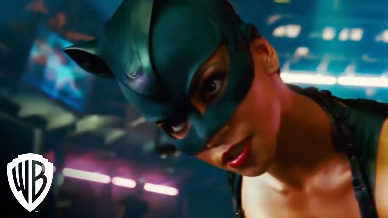
- Impractical and nonsensical: The shredded leather pants, the bra-top, the open-toed heels… none of it made sense for a cat burglar. It was a costume designed for a music video, not a superhero movie.
- The Headpiece: The weird, cat-eared helmet looked cheap and did nothing to conceal her identity. It was more fetish wear than functional costume.
- Trying Too Hard: The entire look reeked of a focus-grouped attempt to be “cool” and “sexy,” but it came across as desperate and out of touch. It was a caricature of a female superhero costume, not a celebration of one.
The film and the suit were so reviled that Halle Berry a good sport about it, even showing up to accept her Razzie Award for Worst Actress in person.
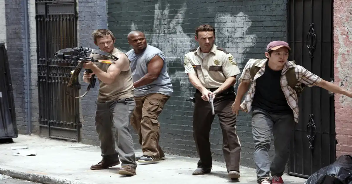
4. Batman & Robin (1997) – The Dark Knight… with Nipples
Ah, the “bat-nipples.” Joel Schumacher’s Batman & Robin is a legendary train wreck, and the costumes are a huge part of its infamous legacy. Schumacher wanted to evoke the look of classical Greek statues, which led to one of the most mocked design choices in film history.
Why it Flopped:
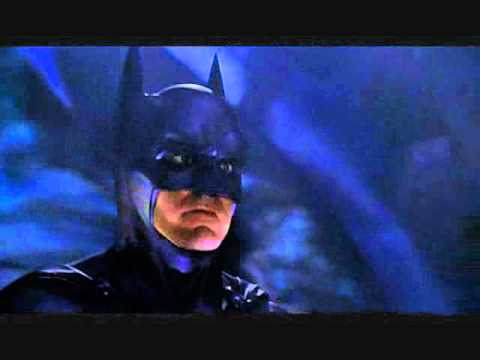
- The Nipples: Let’s just get it out of the way. The decision to add nipples to the Batsuit (and Robin’s suit) was baffling. It was a detail that added nothing and detracted everything, instantly turning the fearsome Dark Knight into a laughingstock.
- Overly Sculpted and Unrealistic: The suits were so heavily molded with exaggerated musculature that they looked less like armor and more like life-sized action figures.
- The Silver Accents: The later versions of the suits in the film incorporated silver, moving even further away from the dark, intimidating look of Batman and creating a garish, toy-etic aesthetic.
In interviews, Schumacher has defended the choice, but the court of public opinion has been merciless. The “bat-nipples” have become a cautionary tale for costume designers everywhere.
5. X-Men (2000) & X-Men: First Class (2011) – A Tale of Two Teams
This is an interesting case because it shows both ends of the spectrum.
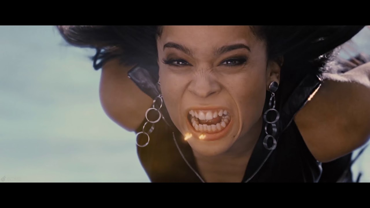
- X-Men (2000) – The Black Leather Debacle: The original X-Men film famously ditched the characters’ iconic, colorful costumes in favor of uniform black leather. The movie even lampshades it with Cyclops’ line, “What would you prefer, yellow spandex?” The reason, as screenwriter David Hayter has explained, was that director Bryan Singer wasn’t a comic fan and found the original costumes too silly. The result was a look that, while “cool” for the post-Matrix era, stripped the X-Men of their individuality.
- X-Men: First Class (2011) – The Yellow Spandex They Warned Us About: For the prequel, director Matthew Vaughn went all-in on the comic accuracy, putting the team in the classic blue and yellow training suits from the early comics. The reaction was… mixed. While many hardcore fans appreciated the nod to the source material, others found the suits looked cheap and out of place in the film’s 1960s setting. It was a bold attempt, but it didn’t quite stick the landing for a mainstream audience.
This highlights the central dilemma: stray too far from the comics, and you alienate the fans. Stick too close, and you risk looking ridiculous.
What do you think? Are there any other comic-accurate suits that just didn’t work on screen? Let us know in the comments below!

